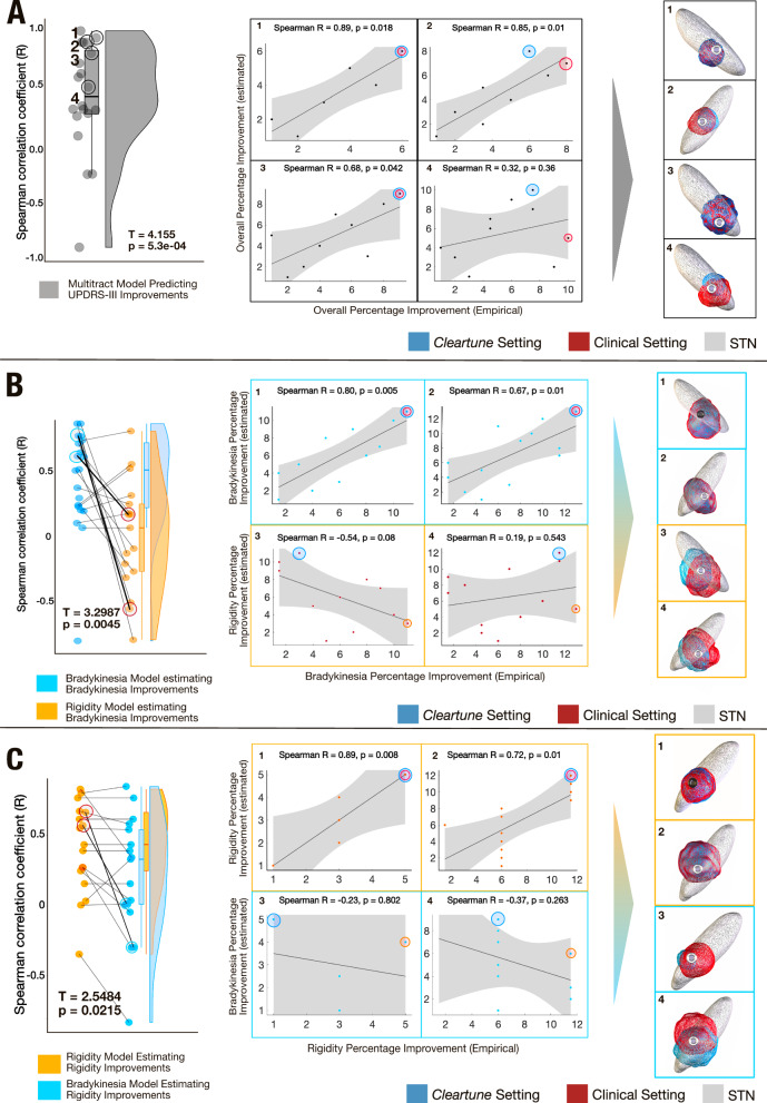
Fig. 6. Retrospective validation on monopolar review dataset.
A The left panel illustrates a raincloud plot where each data point represents a Spearman’s correlation coefficient between estimated and empirical UPDRS-III improvements for settings in one of the 20 electrodes. A one sided t-test is significant, illustrating that Spearman’s rho is positive across most electrodes (T = 4.15, p = 5.3e-04, Average R = 0.41 ± 0.44). All correlation plots are shown in Fig. S32. The right panel gives four representative examples. A red eclipse is used to represent the stimulation contact that renders the highest improvement for a given electrode, while the contact chosen by the model is marked with a blue eclipse, corresponding stimulation fields are shown for the example electrodes. B, C To assess symptom-specificity of the model, the analysis was repeated, this time maximally weighting either bradykinesia or rigidity symptoms, respectively. Correlations across settings in the 20 electrodes were almost all positive when the model was used to estimate improvements in the correct symptom, but significantly dropped when used to estimate improvements in the respective other symptom. In each panel, two representative examples of correct vs. incorrect symptom pairings are given. In both (B) and (C), the T value is derived from a paired t-test between the Spearman’s rho for estimated improvements in the correct symptom (for instance, when the model, trained on bradykinesia improvement estimated empirical bradykinesia improvement, T = 3.2987, p = 0.0045) vs estimated improvements in the incorrect symptom (for instance, when the model trained on bradykinesia improvements estimated rigidity improvement, T = 2.5484, p = 0.02). The shaded area of the correlation plots signifies the 95% confidence interval on the slope of the line. Source data available as source data file.

