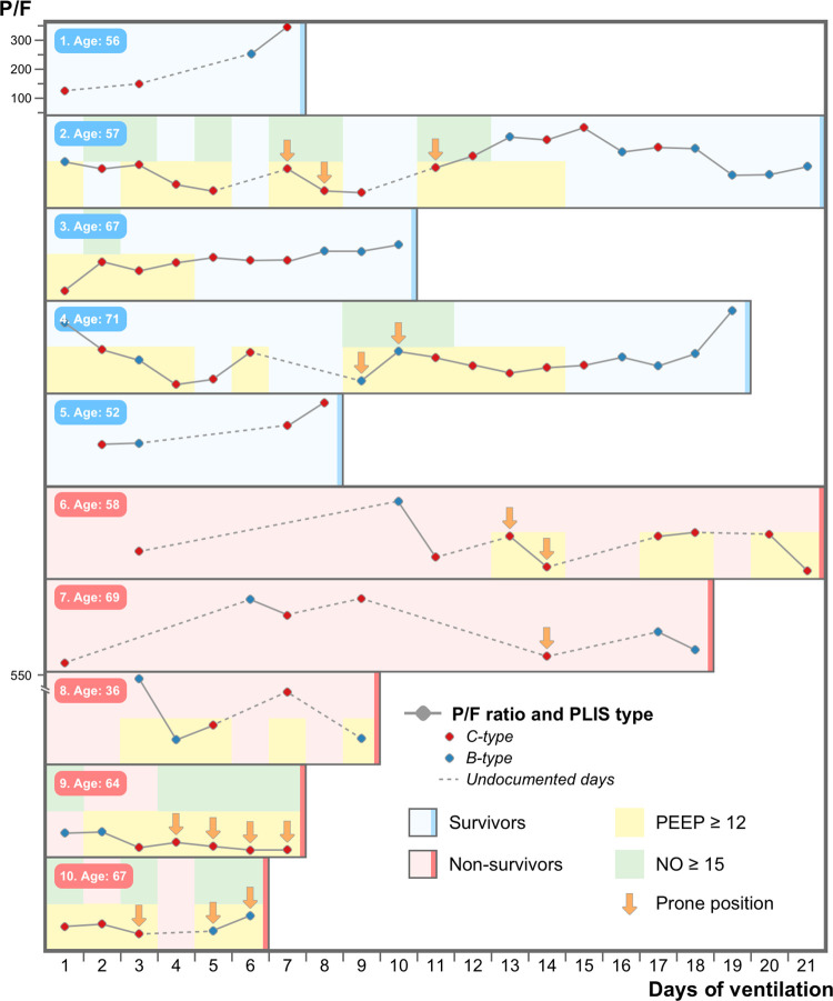
Fig 2. The course of ten representative COVID-19 ARDS ventilated patients* during their Intensive care unit hospitalization.
The figure graphically represents the course of ten ventilated patients with COVID-19 ARDS. half survived (in blue) and half died (in red). The PaO2 to FiO2 ratio is plotted on the y-axis and the days of mechanical ventilation on the x-axis. Each circle represents a single PLIS study performed (red circle for the “c-type” and blue circle for the “b-type”). Vertical arrows signify patients ventilated with prone positioning. Backgrounds colored yellow and green represent patients currently ventilated with a high PEEP (12 cmH2o or more) and a high dose of inhaled nitric oxide (15ppm or above), respectively. *Patients with the most available PLIS data were selected to visually represent the cohort.

