
Figure 1.
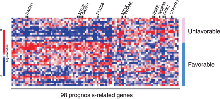
Heat map of expression values for microarray identifying 98 genes whose expressions were correlated with survival. The hierarchical clustering of the 98 genes comparing the unfavorable prognosis group (survival time, <180 days) and favorable prognosis group (survival time, ≥180 days) is shown. The blue or red colors of each block represent the normalized gene expression levels. Each row represents a sample, and each column represents a gene. The 10 genes included in the multivariate analysis (Table 3) are shown.