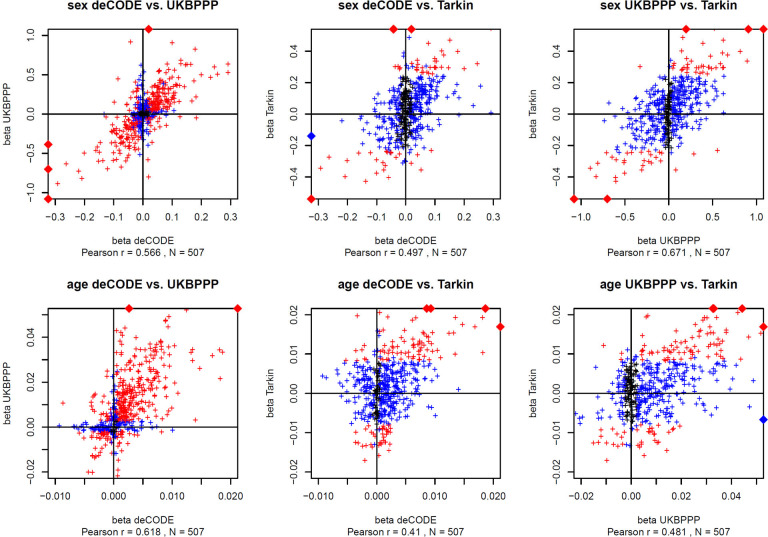
Figure 4: Scatterplot of the effect sizes for the protein associations with sex and age.
Summary statistics for the associations with affinity proteomics were from the respective GWAS studies. Associations that reached Bonferroni significance in both respective studies are in red and in one study are in blue (p < 0.05 / number of reported associations). The effect sizes (beta) are reported in units of standard deviations (s.d.). Data points outside the plotting window are indicated by diamonds on the plot frames. Plot data are available in Table ST4. Scatterplots are limited to 507 unique proteins that were reported by all three studies. In cases where data for multiple affinity binders was reported, the most significant association was retained.

