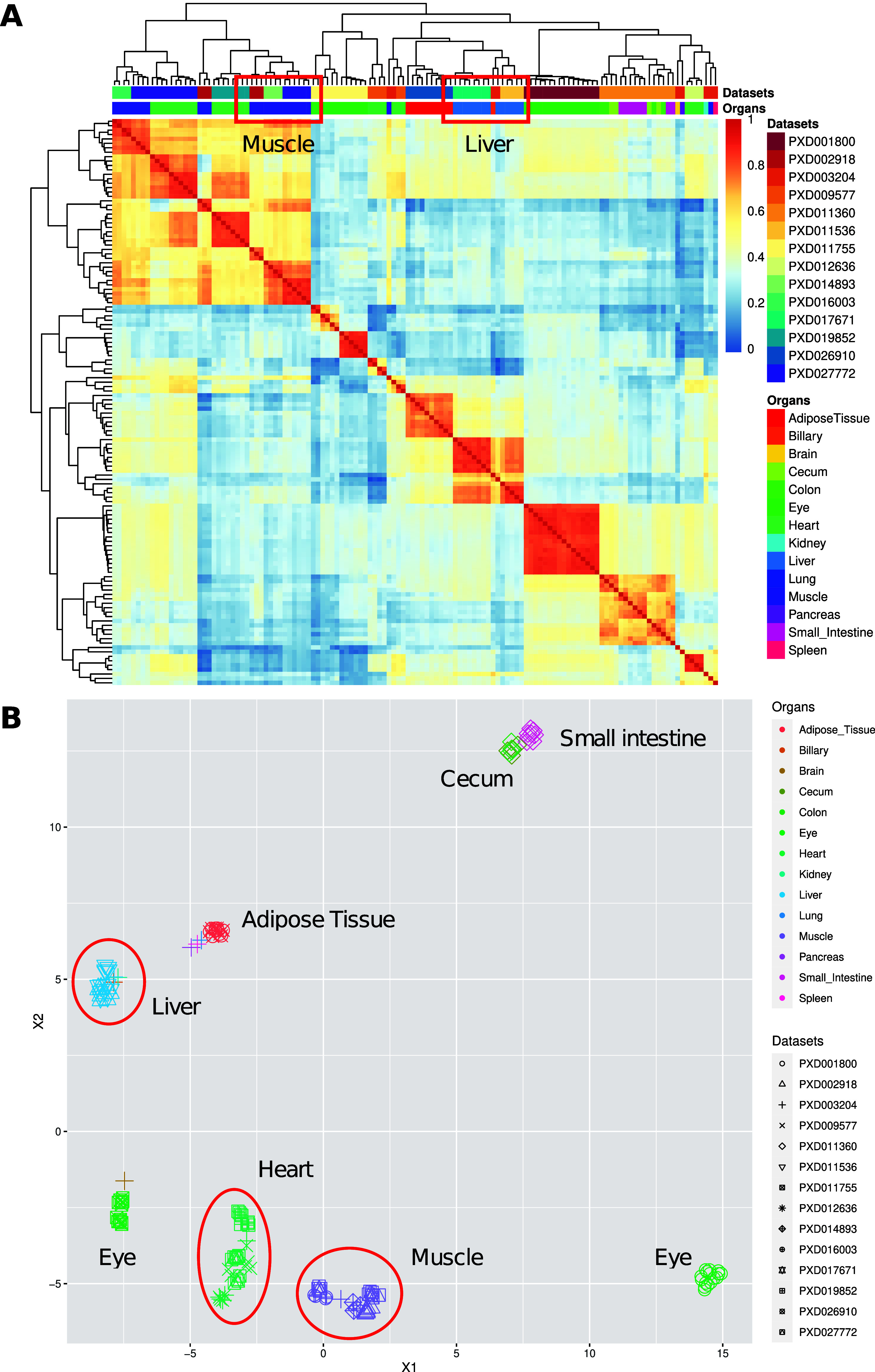
Figure 2.

(A) Heatmap of pairwise Pearson correlation coefficients across all pig samples among data sets and organs. The colors on the heatmap represent the correlation coefficients calculated using the bin transformed values. Hierarchical clustering of the columns and rows of the samples was performed by using Euclidean distances. (B) UMAP representation among different data sets and organs. Groups of data sets coming from the same organ are highlighted.
