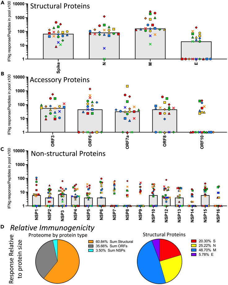
Figure 4.
Evaluation of the immunogenicity of SARS-CoV-2 proteins demonstrates dominance of membrane and poor immunogenicity of the NSP
Based on the CD4 T cell responses to the SARS-CoV-2 proteome, shown in Figure 2, the relative of immunogenicity of each protein was calculated. Responses measured using cytokine producing cells per million, shown in Figure 2, were normalized to the number of peptides contained in each pool by dividing the frequency of cytokine spots per million CD8− and CD56− depleted PBMC by the number of peptides contained in the pool (Table S1) and multiplying by 100. The immunogenicity of the SARS-CoV-2 proteome is shown in the three classes of proteins (A) structural proteins, (B) accessory proteins, and (C) non-structural proteins. Donors are indicated by unique symbols (identified in Figure 1), with the median value illustrated by a gray shaded bar. In panel D, the average immunogenicity is represented by pie diagrams. The median response of the population for the sum of the proteins from each class, relative to peptide pool size, indicating the relative immunogenicity is shown in the left pie diagram; structural proteins (orange), accessory proteins (grey), and non-structural proteins (turquoise). To the right, the relative immunogenicity of each of the structural proteins, spike (red), nucleocapsid (yellow), membrane (blue), and envelope (purple) are shown.

