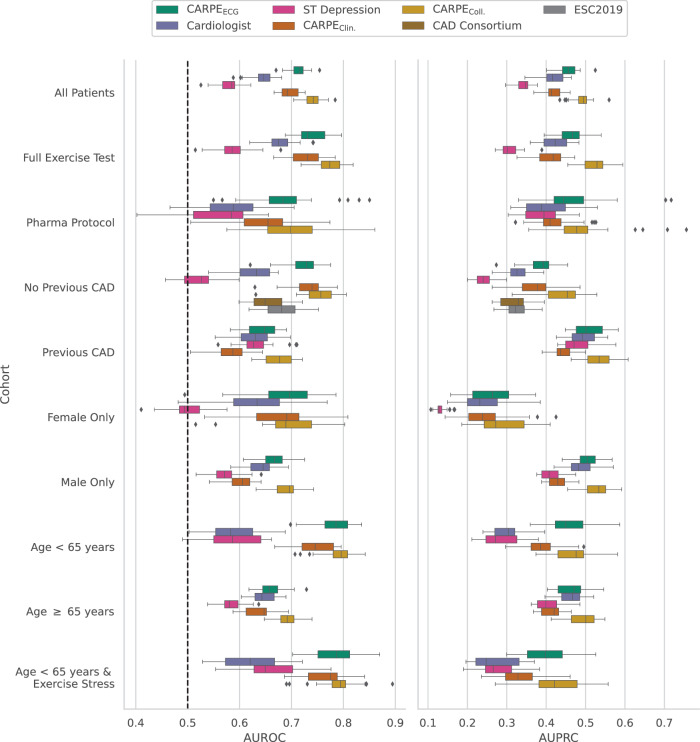
Fig. 3. Diagnostic performance subcohort analysis.
Performance breakdown over different subcohorts and n = 25 bootstrap draws. The dashed black line indicates the AUROC of a random classifier. Over the full cohort (All Patients), both CARPEClin. and CARPEECG reach a statistically significantly higher AUROC than the cardiologist. Additionally, the collaborative approach (CARPEColl.) significantly increases predictive performance over CARPEECG. Please refer to Supplementary Table 6 and Supplementary Fig. 4 for more details. Box plots indicate median (middle line), 25th, and 75th percentile (box). Whiskers extend to points that lie within 1.5 IQRs of the lower and upper quartile. Diamonds are outliers. Error bars in the bar plots indicate 95% confidence intervals. Source data are provided as a Source Data file.

