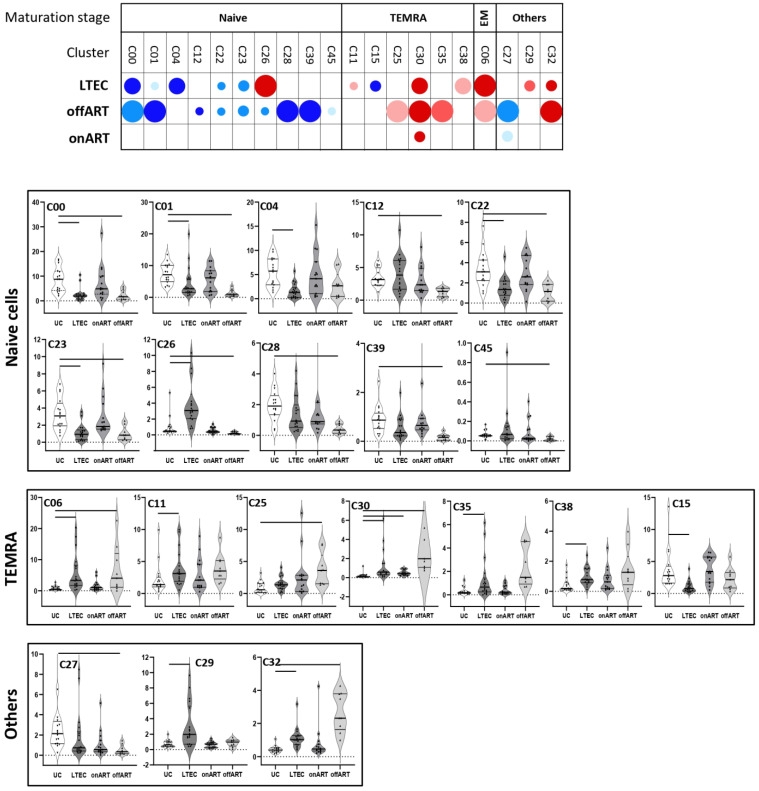
Figure 2.
The upper graph of the figure shows a schematic representation (bubble diagram) of CD8 T cell clusters, with significant differences between the PLWH groups and the UC group. Clusters are grouped according to maturation stage (defined by CD45RA and CCR7 markers). Each bubble in the diagram represents a significant difference with respect to the UC group. The size of the bubble (from the smallest to the biggest size) indicates the degree of difference in fold-change: <2, 2–3, 3–4, 4–5, and >5. Red colors indicate an increase and blue colors indicate a decrease with respect to the UC group. The level of statistical significance (corrected p-value) is indicated by the color tone: 0.05–0.01, 0.01–0.001, and <0.001 for the light, medium, and dark tones, respectively. The lower graphs of the figure show violin plot graphs of the levels (expressed as a percentage of total CD8 T cells) of each cluster in the four study groups. As in the upper graph, clusters are grouped according to maturation stage. In each violin plot graph, bars inside the plots indicate those PLWH groups that showed a statistically significant difference with respect to the UC group.

