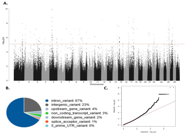
Figure 2.
Results of the GWAS analysis. (A) Manhattan plot of the –log10 of the p-values of the association test between each SNP and the IFNɣ levels. Each dot represents one SNP. Chromosome localization of the SNPs is indicated on the x-axis. The horizontal red line is drawn at –log10 (5 × 10⁻⁷); (B) Genomic distribution of the 163 SNPs surpassing the threshold (p-value ≤ 5 × 10⁻⁷) according to the Ensembl Variant Effect Predictor (VEP); (C) Quantile–quantile plot comparing the observed distribution of –log (p-values) to the expected values under the null hypothesis.

