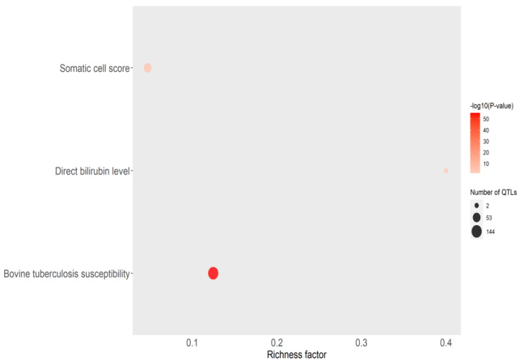
Figure 3.
Bubble plot displaying the QTL enrichment results for health traits. The darker the red shade in the circles, the more significant the enrichment. The area of the circles is proportional to the number of QTLs. The x-axis shows a richness factor obtained by the ratio of the number of QTLs annotated and the total number of each QTL in the reference database.

