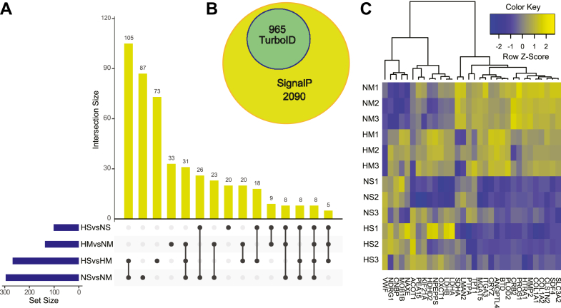
Fig. 4.
Proteomic differences of pericyte-secreted proteins in response to environmental cues.A, upset plot demonstrating shared or specific differentially secreted proteins between the different experimental conditions. The blue bars on the y-axis represent total number of proteins for comparison in each set size. The yellow bars on the x-axis represent the number of significantly differentially secreted proteins specific to a singular comparison or shared across comparisons illustrated by the black dots. B, Venn diagram of our TurboID dataset with predicted SignalP peptides. C, heatmap of hierarchical clustering by z-score intensities to identify the top 10 (maximum) FC >2 with p < 0.05 upregulated genes after 24 h of hypoxia for mono- or spheroid-cultures, respectively. The numbering indicate independent replicates, n = 3. HM, hypoxia–monoculture; HS, hypoxia–spheroids; NM, normoxia–monoculture; NS, normoxia–spheroids.

