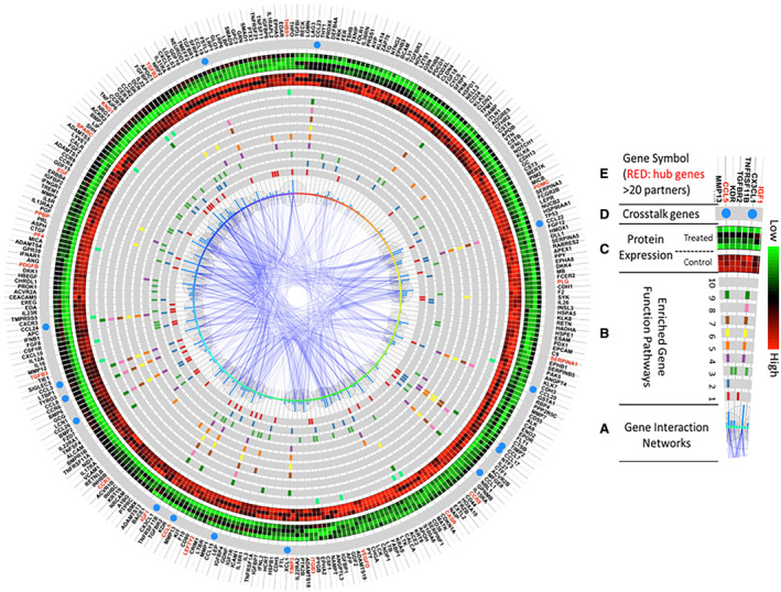
Figure 9. Integrated function and network analysis from coronary sinus samples 3 days after porcine myocardial infarction reveal that differentially expressed proteins are involved in inflammatory response, chemotaxis, and cell signaling.

The enriched pathway analysis was generated using R programming software, and the top 10 most significant were selected. A, The center of this figure represents gene interaction networks. The larger the bubbles or higher the blue bars, the more interacting network partners connect to a given protein. B, Genes involved in the top 10 most significantly enriched function pathways are highlighted in each gray circle. The various colors represent genes in different pathways. From the innermost to outermost circles, the pathways consist of: (1) inflammatory response; (2) cell–cell signaling; (3) positive regulation of cell proliferation; (4) monocyte chemotaxis; (5) cellular response to tumor necrosis factor; (6) neutrophil chemotaxis; (7) cellular response to interleukin‐1; (8) lymphocyte chemotaxis; (9) positive regulation of inflammatory response; (10) negative regulation of angiogenesis. C, Protein expression levels of the control cohort (n=3; inner circle—red predominant) and infliximab‐treated cohort (n=4; outer circle: green predominant). Green represents higher expression, and red represents lower expression. D, Genes present in >5 of the top 10 enriched pathways, represented by a blue circle, serve as crosstalk between pathways. (E) Official gene symbols. Proteins with >20 interacting partners are labeled in red, and proteins with <20 interacting partners are labeled in black.
