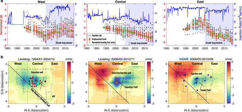
Fig. 3. Observed vertical displacement trends of the Heber Geothermal Field.
a Comparison of normalized vertical displacement (Uz) trends (red bars) of the west, central and east regions with injection rates shown by blue curves. The red bars reflect the variability in normalized leveling time series rather than observation errors. Gray curves with cross symbols show the normalized displacement time series of leveling benchmarks (see also Supp. Figure 1). The displacement trends are obtained through averaging the normalized time series. Shaded regions mark decade-long displacement transients. The blue curves with axes on the right show net injection rate for wells in three sub-regions: positive and negative values represent net injection and net extraction, respectively. b Vertical displacement rate maps derived from interpolation of leveling and InSAR observations in three time periods.

