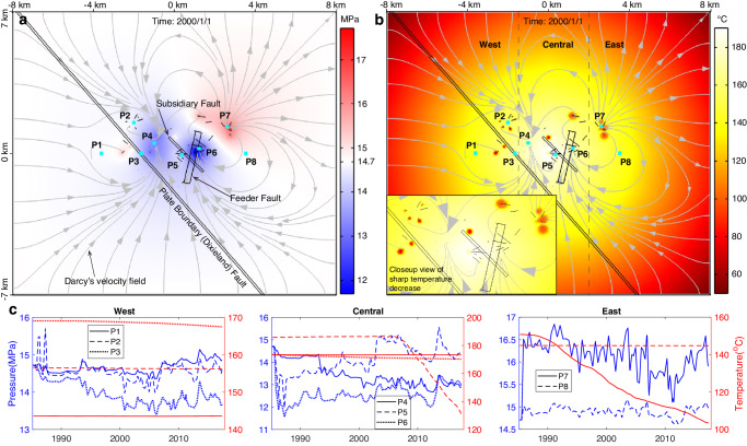
Fig. 7. Simulated pressure and temperature changes at the bottom of the upper reservoir (depth = 1.5 km).
a Pressure distribution at a time node after ~8 years of geothermal operation with gray curves and arrows showing the movement of fluid. Red and blue colors represent an increase and decrease in pressure relative to the initial pressure (14.7 MPa), respectively. b Temperature distribution after ~8 years of operation. c Pressure and temperature variations at 8 probe points distributed within the west, central and east regions of the HGF.

