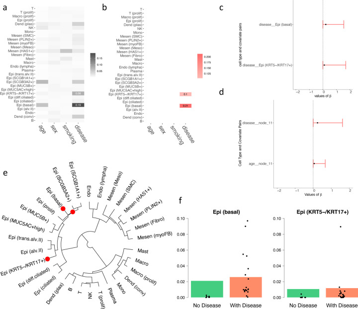
Figure 3:
Results on the PF dataset. (a) Heatmap showing the relationship between covariates and cell types, with darker colors indicating stronger relationships. (b) Heatmap of estimated regression coefficients, where red indicates a positive correlation. (c) 95% credible interval for the significant chosen by the threshold controlling the FDR < 0.05. (d) 95% credible nterval for the significant of the tree structure chosen by the threshold controlling the FDR < 0.05. (e) Cladograms of the identified cell types, where red dots represent the nodes of cell types that have a significantly higher abundance when diagnosed with PF. (f) The underlying barplot represents the predicted proportions of the certain cell type by the model, with black dots showing the actual proportions of this cell type in each patient in the dataset.

