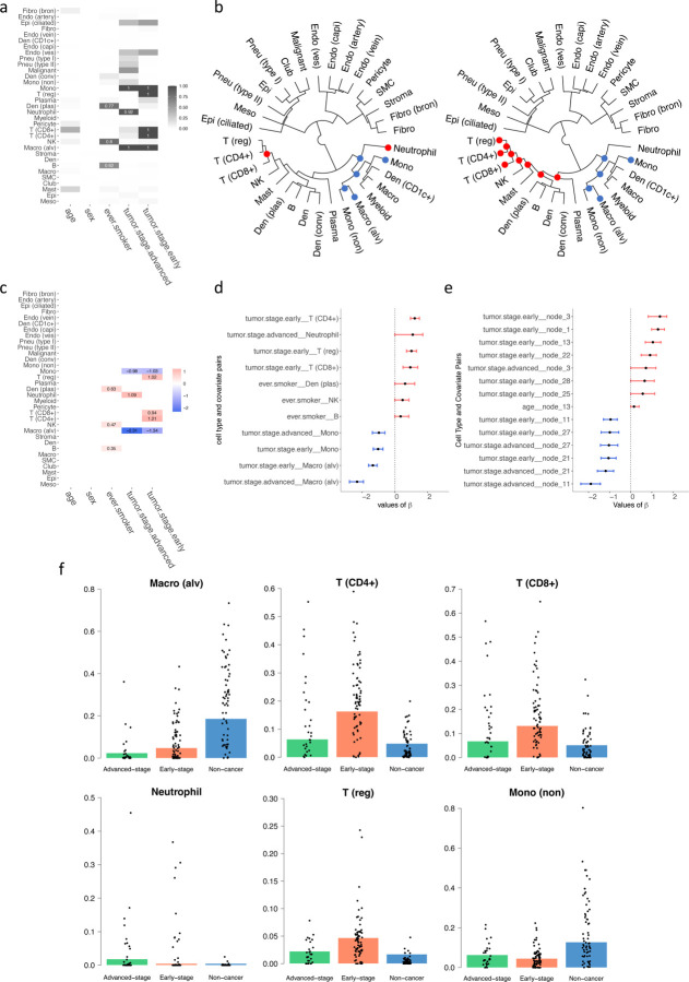
Figure 5:
Results on the lung cancer dataset. (a) Heatmap showing the relationship between covariates and cell types, with darker colors indicating stronger relationships. (b) Cladogram of the identified cell types, with tumor stages shown as advanced (left) and early (right); red dots indicate nodes of cell types with significantly higher abundance, and blue signifies lower abundance. (c) Heatmap of estimated regression coefficients, where red indicates a positive correlation, and blue denotes a negative correlation. (d) 95% credible interval for the significant chosen by the threshold controlling the FDR < 0.05. (e) 95% credible interval for the significant of the tree structure chosen by the threshold controlling the FDR < 0.05. (f) The underlying barplot represents the predicted proportions of the certain cell type by the model, with black dots showing the actual proportions of this cell type in each patient in the dataset.

