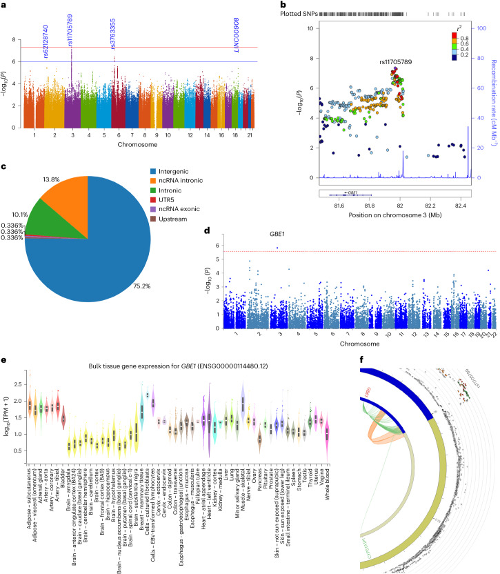
Fig. 5. Genetic associatons with G6 and likely functional relevance.
a, A Manhattan plot of the genome-wide association analysis of G6. The x axis shows SNP chromosome positions, and the y axis shows the corresponding −log10 two-tailed P values from the two-sided BOLT infinitesimal model. The horizontal red line indicates the genome-wide significance threshold at P = 5 × 10⁻⁸. The horizontal blue line indicates the suggestive genome-wide significance threshold at P = 1 × 10⁻⁶. The nearest gene or top SNP is highlighted for loci associated at P < 1 × 10⁻⁶. b, Regional association and LD plots for G6-associated genome-wide significant locus. The x axis shows SNP position on the chromosome, and the y axis shows −log10(P value). Tick marks at the top of the plot indicate SNP position. The independent SNP is indicated by the purple diamond. The circles show other SNPs in pairwise LD with the independent SNP, with color indicating the strength of LD (r2). The strength of LD (r2) is presented in the upper left corner of the plot. Estimated recombination rates are marked in light blue. Bottom: genes within ±500 kb of the independent SNP. c, A pie chart showing the proportion of the functional consequences of G4-associated independent SNP and its proxies as annotated with ANNOVAR. d, A Manhattan plot for the GWGBA analysis of G6. The y axis shows the −log10-transformed two-tailed P value of each gene from a linear model, and the x axis shows the chromosomal position. The dotted red line indicates the Bonferroni-corrected threshold (P = 2.614 × 10⁻⁶) for the genome-wide significance of the gene-based test. The gene with the lowest P value is highlighted. e, Bulk tissue expression of the GBE1 gene across tissue types from GTEx v8. The y axis represents transcripts per million (TPM), and the x axis represents the GTEx (V.8) tissues. Box plots feature the median, 25th and 75th percentiles. Points are displayed as outliers if they fall beyond 1.5 times the interquartile range. The figure was adapted from the GTEx Portal (https://www.gtexportal.org/home/gene/GBE1). f, A circos plot displaying chromatin interactions (Ci) and eQTLs for rs11705789. The outermost layer shows the Manhattan plot with −log10(P value) for the G6-associated locus, and SNPs with P < 0.05 are displayed. The LD relationship between rs11705789 and other SNPs is indicated with red (r2 > 0.8), orange (r2 > 0.6) and green (r2 > 0.4) colors. Gray SNPs show minimal LD with r2 ≤ 0.20. The second circle represents the chromosome ring with coordinates, where the genomic risk locus is highlighted in blue. The third circle shows the same chromosome ring, but with Ci- and eQTL-mapped genes represented by orange and green lines, respectively. Genes mapped by both approaches are colored red.

