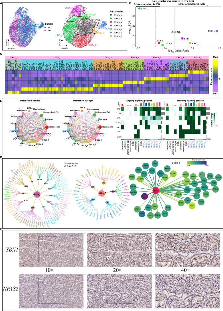
Figure 4.
Heterogeneity within UNC clusters
A: UMAP clustering of UNC spots based on two developmental stages (left) and gene expression (right). Cells are colored according to their developmental stage or types. B: Differences in cluster abundance plotted as log10 odds ratios against adjusted P-value –log10 FDR. Solid horizontal line represents significance threshold of 0.05 and vertical dotted lines represent a 1.5-fold change in either direction. C: Heatmap of DEGs in each UNC subcluster based on two developmental stage samples. D: Left: Number (left) and weight (right) of interactions between UNC subcluster and all clusters. Different colors represent different signal sources. Line width indicates number/weight of interactions. Right: Heatmap of CellChat signaling in each UNC subcluster. Left panel shows outgoing signaling patterns (expression weight value of signaling molecules) and right panel shows incoming signaling patterns (expression weight value of signaling receptors). E: Top candidate master regulators and their target genes for UNCs_2 (left), UNCs_3 (center) and UNCs_5 (right) subclusters. Bubble size indicates weight from high to low. F: Immunohistochemical results of NPAS2 and YBX1 in cow placenta. Scale bar: 200 μm (10×); 100 μm (20×); 50 μm (40×).

