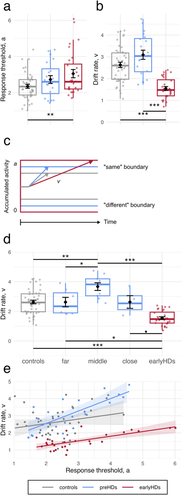
Fig. 3. Results of DDM analyses.

Boxplots of (a) Response threshold a and (b) drift rate v of each group. c Schematic representation of model parameters of each group. d Relationship between the drift rate (y-axis) and time to predicted age-at-onset (x-axis). e Relationship between the drift rate (y-axis) and the response threshold (x-axis). Points represent individual values, lines and shades around them represent the linear fit and the confidence interval, respectively. Controls are represented in grey (n = 45), premanifest participants (preHDs) in blue (n = 20, n = 7 far, n = 9 middle, n = 4 close to onset), and early-stage Huntington’s disease patients (earlyHDs) in red (n = 28). In boxplots in (a), (b), and (d), the middle hinge corresponds to the median, the lower and upper hinges correspond respectively to the first and third quartiles.
