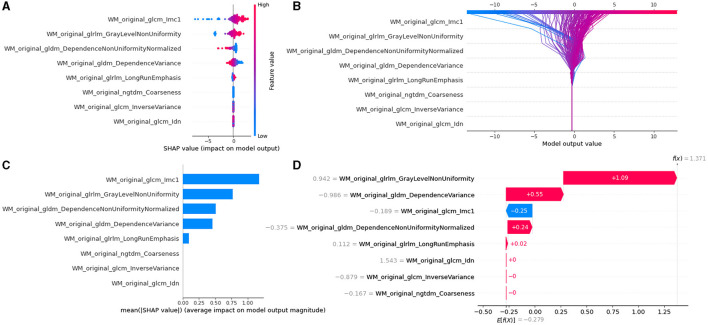
Figure 7.
Model interpretability of the KW8LRLasso model with SHapley Additive exPlanations (SHAP). (A) Summary plot of feature impact on the decision of the model showing positive and negative relationships of the predictors with the target variable. A positive SHAP value indicates an increase in the probability of PD. (B) Decision diagram of the KW8LRLasso model. The vertical gray line in the middle of the decision graph represents the basic value of the model. The colored line, on the other hand, indicates the prediction and shows whether each feature moves the output value above or below the average predicted value. The eigenvalues are positioned next to the prediction line for reference. Moving to the bottom of the diagram, the prediction line demonstrates the accumulation of SHAP value from the base value to the final score of the model at the top of the diagram. (C) Variance importance plot listing the most significant variables. The features that were more valuable for the diagnosis of PD were located at the top, presented in descending order. (D) Waterfall diagram of the first sample in the KW8LRLasso model. The waterfall diagram is designed to provide an explanation for a single prediction. It takes a single line of the interpreted object as input. The diagram begins with the expected value of the model output at the bottom. Each row then indicates whether each feature has a positive (red) or negative (blue) contribution. In other words, it shows how the value is pushed from the model's expected output value on the data set to the model's predicted output value. It is worth noting that the most contributing factor is 'WM_original_glrlm_GrayLevelNonUniformity'.

