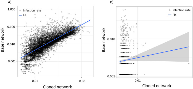
Fig 6. Comparison of infections in base and cloned networks.
(A) For a set of source posts sampled across all users in our base network, we plot the infection rates extracted from simulating these events within our ABM versus the infection rate measured in the base network ABM (Pearson correlation in log-space equal to 0.81, p < 0.01). Infection rate, which is calculated as number of infections divided by the number of source author followers, is presented to provide a consistent scale across the observations. (B) A similar plot to (A), except all events are sampled from uS (Pearson correlation in log-space equal to 0.08, p = .075). Since all author-level features are fixed for these events, the visualization conveys the extent to which the ABM can anticipate variations in virality arising solely from post text. In both plots, the blue solid line represents a linear fit to the data, with the bands denoting the 95% confidence intervals of the fit.

