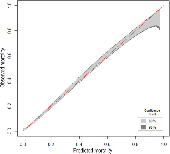
Fig. 1.

Calibration belt for 16 784 patients from the SAPS 3 database [34, 35] describing the relationship between predicted and observed hospital mortality, which is depicted as the fraction of non-survivors. The plot was generated using the R package givitiR [36]. The overlay between the identity function (red line) and the calibration belt with narrow confidence intervals (shaded areas-see inset) indicates a good agreement between model predictions based on the SAPS 3 score and observed outcomes for most of the range of hospital mortality
