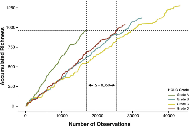
Fig. 1.
Greenlined neighborhoods detect more unique species with less sampling effort. Species accumulation curves for each HOLC grade across six clades. The x-axis shows the number of observations within each HOLC grade. The y-axis shows accumulated species richness. The dashed horizontal line* shows the maximum accumulated richness for grade A. The vertical lines** show the number of observations to reach grade A’s maximum accumulated richness in grade A (left vertical line) and in grade D (right vertical line). The difference in observations between redlined (i.e., grade D) and greenlined (i.e., grade A) neighborhoods is shown as a delta value. *Horizontal line: y = 964. **Vertical lines (grade A, grade D): x = 17,095; 25,445.

