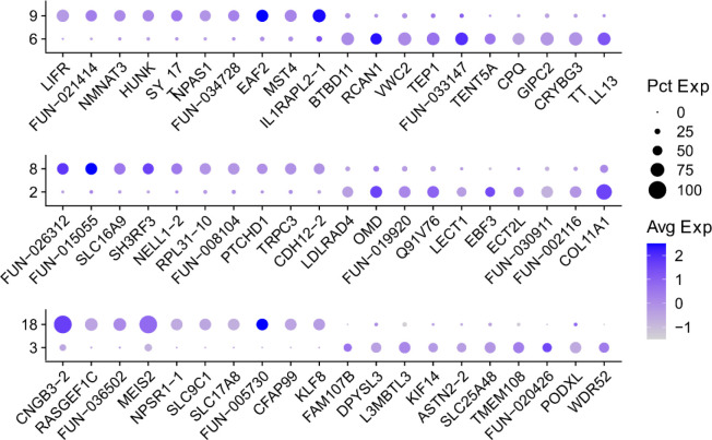
Extended data Figure 5.
Dotplots showing genes (columns) that distinguish pairs of Rhabdomys BC types (rows) that map to the same Mus BC type. The size of each circle represents the percentage of cells within a type that express the given gene, and the color represents the average expression of that gene within that cluster.

