
Figure 8.
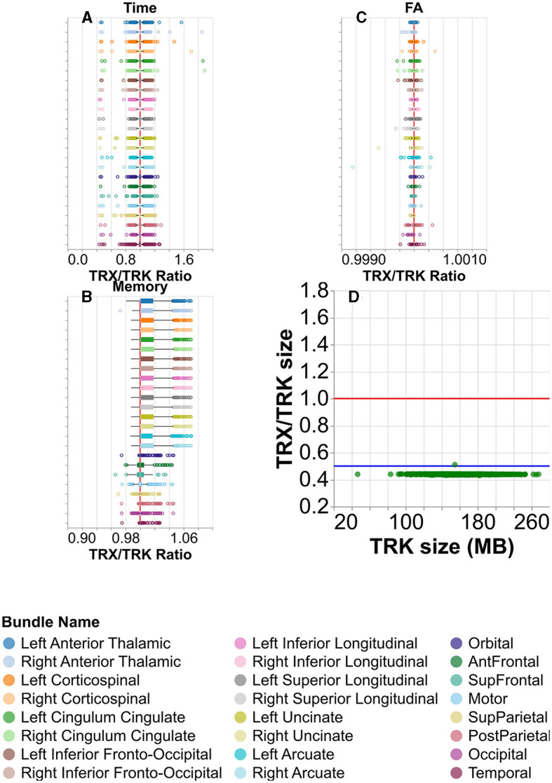
Comparing the TRK and TRX file formats. (A) Box and whisker plots for visualizing the distribution of the ratio of times taken to calculate tract profiles, per subject. Here, higher values would indicate it took longer to calculate tract profiles using TRX than TRK. There is a vertical red line at ratio = 1. The color/row corresponds to the tract. (B) Similar plot showing the memory taken to calculate tract profiles, and (C) the mean FA calculated. Note that in (A–C), the median tightly hugs the ratio = 1 line. (D) The ratio of the TRX and TRK disk space size is shown for each subject in green. There is again a red line at ratio = 1, but here there is also a blue line at ratio = 0.5. Notice that the TRX/TRK size per subject in green is always near or below the blue ratio = 0.5 line.