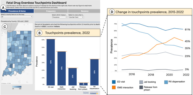
Figure 2.

The final dashboard showing overall touchpoints prevalence in Indiana. (A) Buttons enable the user to switch among 4 measures: prevalence, rates, frequency, and recency of touchpoints. (B) The selected measure is visualized here as a bar chart comparing touchpoint prevalence (ie, the percentage of decedents who used each of the 5 touchpoints). (C) A map shows touchpoint prevalence (in this case for emergency department [ED] visits) by county, where darker shades of blue indicate higher prevalence. (D) As an alternative to the bar chart, a line graph allows users to observe how the prevalence of the touchpoints changes from year to year. EMS: emergency medical services; Rx: medical prescription.
