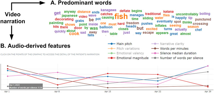
Figure 7.
Examples of Data Visualization. The figure illustrates the graphs generated for the (A) ‘predominant words’ metric and (B) several audio-derived metrics. The latter are identified by different colors on a single plot. The specific value of each point in each variable is revealed by placing the mouse (or a finger, in the case of touch-screens) on the data point. Note that, while the figure illustrates successive assessments through weekly measurements, longitudinal differences in neurodegenerative diseases may likely require several months to become evident.

