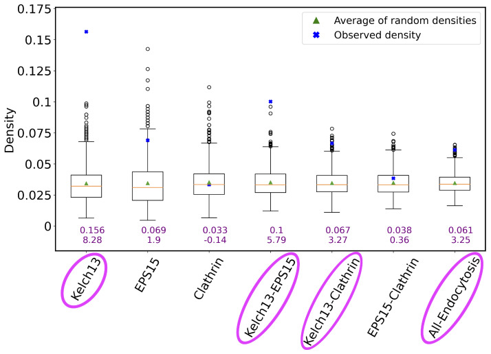
Figure 8.
The connectivity of genes in a given list/set (or simply group) compared to the genes’ connectivity expected by chance. The x axis shows the considered endocytosis-related gene groups. The y axis corresponds to connectivity as measured by network density (for a gene group of size n, where there exist e edges between the n genes, and the density is the ratio of e and , where the latter is the total possible number of edges between n nodes). The boxplot for a given gene group represents the density distribution of 1000 random runs for that group. In particular, if a given gene group has n genes, the connectivity by chance is measured by calculating the density of a subnetwork consisting of randomly selected n genes and their edges from the Consensus network. The green triangle in each boxplot/for each group is the average density of the 1000 randomly selected subgraphs. The orange line is the median of the 1000 random densities. The blue cross point is the actual (observed) density of the given gene group, whose numerical value is also shown as the top purple number below the given boxplot. The other (bottom) purple number below the given boxplot is the z score of the observed density when contrasted against the random densities. The names of endocytosis-related gene groups that are shown in pink ovals correspond to those groups that are significantly more densely connected than at random).

