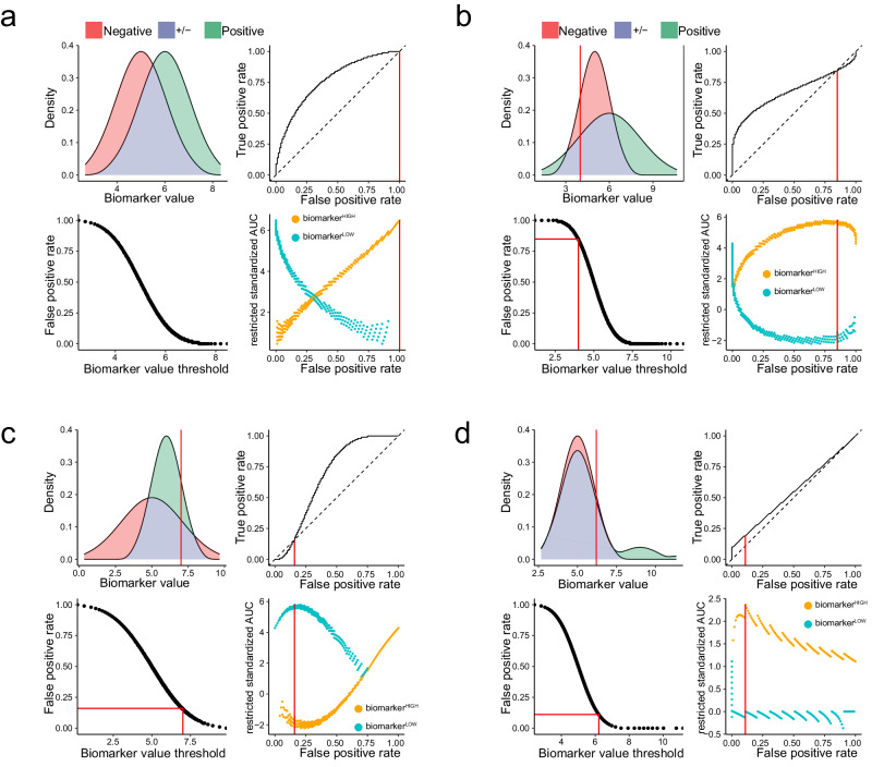
Fig. 3. Optimal restriction of two-class distributions results in asymmetric ROC curves.
We present four simulated examples of biomarker distributions in two classes, which are intended to represent sets of patients with different clinical outcomes. The distribution of values from the positive (i.e. diseased) class are coloured green and values from the negative (i.e. control) class are coloured red; the overlapping density areas are coloured purple. For each example, we present the following: a plot of positive and negative class densities; the complete ROC curve; a plot of biomarker values against FPR; a plot of rzAUC calculated for biomarkerHIGH (orange) and biomarkerLOW (blue) samples at all FPR values. In each plot, red lines indicate the optimal restriction as a biomarker value or FPR value. a A simulated example of a symmetric ROC curve from 100 negative and 100 positive samples. b A simulated example of a right-skewed ROC curve from 100 negative and 100 positive samples. c A simulated example of a left-skewed ROC curve from 100 negative and 100 positive samples. d Results for a right-skewed ROC curve from 100 negative samples and 100 positive samples from a bimodally distributed positive population. In this example, the positive population comprises 10% cases with elevated biomarker expression and 90% cases with unaltered biomarker expression .

