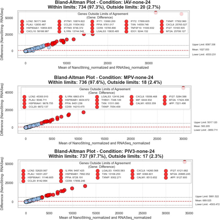
FIGURE 3.
Bland-Altman plots for RNA-Seq and NanoString gene expression comparisons: This series of plots evaluates the agreement between RNA-Seq and NanoString platforms across three different conditions. Each plot visualizes the difference between the two measurement methods against their average value, facilitating a clear depiction of concordance and discrepancies. The x-axis represents the average of the normalized counts from both methods, while the y-axis displays the differences (NanoString—RNA-Seq). A dashed red line in each plot denotes the mean difference, providing an estimate of the overall bias between the methods. Dashed grey lines indicate the limits of agreement, calculated as the mean difference ± 1.96 standard deviations, representing the range within which 95% of future differences are expected to lie, assuming a normal distribution. Points are color-coded: within the limits are shown in blue, and those beyond are in red. Genes that fall outside these limits are specifically highlighted and labeled to show significant deviations. The title within each plot specifies the condition, counts the total number of genes, and notes the proportion of genes within and outside the limits of agreement, offering a succinct yet comprehensive overview of the data consistency and variation.

