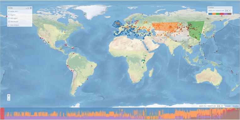
Figure 3.
Selection of geographic regions based on population structure analysis. ADMIXTURE results are plotted on the map, with samples colored according to their largest ancestry component. This can be selected using the ‘Colorbar’ menu on the top right, using the pre-loaded ADMIXTURE results, or after adding user-generated ADMIXTURE results (see Adding datasets). The STRUCTURE-plot for all samples in the selected window is at the bottom of the screen, ordered according to longitude. Geographic regions have been manually selected on the map to roughly correspond to the plotted ADMIXTURE results.

