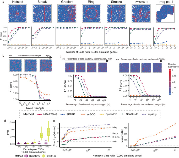
Fig. 2. Simulation results show that HEARTSVG has high accuracy and good scalability and computational efficiency.
a Visualization of seven representative spatial expression patterns. score plots compare the accuracy (y-axis) of HEARTSVG, SpatialDE, SPARK, SPARK-X, scGCO and Squidpy in simulation data with varying numbers of cells (x-axis). The score for each method at each noise level represents the average of 10 replications. Each replicate simulation involved n = 3,000 cells with 10,000 simulated genes generated using a ZINB distribution. b score plots compare four different methods across varying levels of Gaussian noise (x-axis). The score for each method at each noise level represents the average of 10 replications. Each replicate simulation involved n = 3,000 cells with 10,000 simulated genes generated using a Poisson distribution. c score plots compare four different methods across varying percentages of randomly exchanged expression values of cells (x-axis). The score for each method at each noise level represents the average of 10 replications. Each replicate simulation involved n = 3,000 cells with 10,000 simulated genes generated using a ZINB distribution. Figure 2a, b, and c share a common legend. d False positive rate (FPR, y-axis) boxplots of HEARTSVG and SPARK-X in simulation data of hotspot pattern with different percentages of SVGs(x-axis). Boxplots were generated from 50 replications for each percentage of SVGs. Each replicate simulation involved n = 5,000 cells with 10,000 simulated genes generated using a ZINB distribution. In each boxplot, the lower hinge, upper hinge, and center line represent the 25th percentile (first quartile), 75th percentile (third quartile), and 50th percentile (median value), respectively. Whiskers extend no further than ±1.5 times the inter-quartile range. Data beyond the end of the whiskers are considered outliers and are plotted individually. e Plot shows time consumption in (y-axis) and memory usage in GB (y-axis) of each method for analyzing 10,000 genes with different numbers of cells (x-axis). Source data are provided with this paper.

