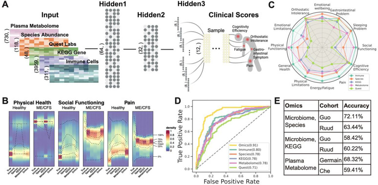
Figure 2: BioMapAI’s Model Structure and Performance.
A) Structure of BioMapAI. BioMapAI is a fully connected deep neural network comprised of an input layer , a normalization layer (not shown), three sequential hidden layers , and one output layer . Hidden layer 1 ( 64 nodes) and hidden layer 2 ( nodes), both feature a dropout ratio of 50% to prevent overfitting (visually represented by dark and light gray nodes). Hidden layer 3 has 12 parallel sub-layers each with 8 nodes to learn 12 objects in the output layer representing key clinical symptoms of ME/CFS. B) True vs. Predicted Clinical Scores highlight BioMapAI’s accuracy. Three example density maps (full set, Supplemental Figure 2A) compare the true score, (Column 1) against BioMapAI’s predictions generated from different ‘omics profiles - , , , , (Columns 2–6). The color gradient from blue (lower density) to red (higher density) illustrates the occurrence frequency (e.g., true scores for ~100% of healthy controls’ physical health ~ 0 = red), with dashed lines indicating key statistical percentiles (100%, 75%, 50%, 25%, and 0%). Note that model’s predicted scores a preserve differences between healthy controls and patients for these three examples, irrespective of ‘omics type. C) ‘Omics’ Strengths in Symptom Prediction. Radar plot shows BioMapAI’s performance in predicting the 12 clinical outcomes for each ‘omics datatype. Each of the 12 axes represents a clinical score output (), with five colors denoting the ‘omics datasets used for model training. The spread of each color along an axis reflects the normalized mean square error (MSE, Supplemental Table 2) between the actual, , and the predicted, , outputs, illustrating the predictive strength or weakness of each ‘omics for specific clinical scores. For instance, species abundance predicted gastrointestinal, emotional, and sleep issues effectively, while the immune profile was broadly accurate across most scores. D) BioMapAI’s Performance in Healthy vs. Disease Classification. ROC curves show BioMapAI’s performance in disease classification using each ‘omics dataset separately or combined (‘Omics’), with the AUC in parentheses showing prediction accuracy (full report in Supplemental Table 3). E) Validation of BioMapAI with External Cohorts. External cohorts with microbiome data (Guo et al.28, Ruud et al.29) and metabolome data (Germain et al.30, Che et al.32) were used to test BioMapAI’s model, underscoring its generalizability (detailed classification matrix, Supplemental Table 4). Abbreviations: KEGG, Kyoto Encyclopedia of Genes and Genomes; ‘Omics’ refers to the combined multi-‘omics matrix; MSE, Mean Square Error; ROC curve, Receiver Operating Characteristic curve; AUC, Area Under the Curve; , True Score; , Predicted Score. Supporting Materials: Supplemental Tables 2–4, Supplemental Figures 1–2.

