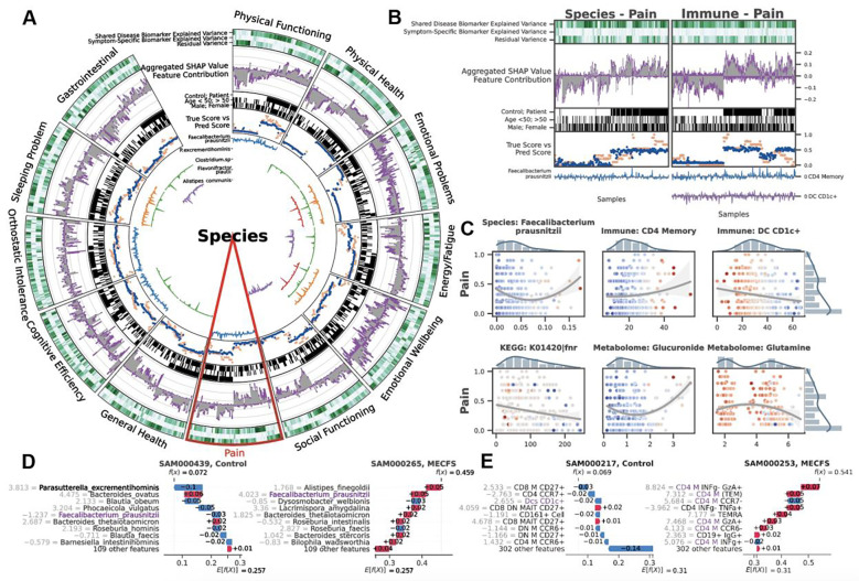
Figure 3: BioMapAI Identifies both Disease- and Symptom-Specific Biomarkers.
For Symptom-Specific Biomarkers, A) Circularized Diagram of Species Model with B) Zoomed Segment for Pain. Each circular panel illustrates how the model predicts each of the 12 symptom-specific biomarkers derived from one type of ‘omics data (all datatypes shown in Supplemental Figure 4). The x-axis for each panel represents an individual’s values for each of the following contributors to the model’s performance (from top to bottom): 1. Variance Explained by Biomarker Categories: Gradients of dark green (100%) to white (0%) show variance explained by the model. For many biomarkers, disease-specific biomarkers account for the greatest proportion of variance, and symptom-specific biomarkers provide additional tailored explanations, with residual accounting for the remaining variance; 2. Aggregated SHAP Values quantify the contribution of each feature to the model’s predictions, with disease-specific biomarkers in grey and symptom-specific in purple. 3. Demography and Cohort Classification: cohort (controls, white vs. patients, black); age <50 (white) vs. >50 years old (black); sex (male, white vs. female, black); 4. True vs. Predicted Scores show BioMapAI’s predictive performance at the individual sample level, with true in blue and model-predicted scores in orange; 5. Examples of Symptom-Specific Biomarkers: Line graphs show the contribution of select symptom-specific biomarkers to the model across individuals, e.g., 5 gut species in A). In B), the three features most specific to the pain model include gut microbe F. prausnitzii, CD4 memory T, and DC CD1c+ cells. Peaks above 0 (middle line) indicate a positive contribution and below 0 for a negative contribution. For example, the mixed positive and negative contribution peaks of F. prausnitzii indicated a biphasic contribution to pain intensity. Disease-Specific Biomarkers are shown in Supplemental Figure 3. C) Different Correlation Patterns of Biomarkers to Symptoms: For pain (other symptoms in Supplemental Figure 5), correlation analysis of raw abundance (x-axis) of each biomarker with pain score (y-axis) show monotonic (e.g., CD4 memory and DC CD1c+ markers), biphasic (microbial and metabolomic markers), or sparse (KEGG genes) contribution patterns for those features. Dots represent an individual color-coded to SHAP value, where the color spectrum indicates negative (blue) to neutral (grey) to positive (red) contributions to pain prediction. Superimposed trend lines with shaded error bands represents the predicted correlation trends between biomarkers and pain intensity. Adjacent bar plots represent the data distribution. D-E) Examples of Pain-Specific Biomarkers’ Contributions. SHAP waterfall plots (colors corresponding to gradient in C) illustrate the contribution of individual features to a model’s predictive output. The top 10 features for two pairs of controls and patients are shown here, illustrating the species and the immune model (additional examples in Supplemental Figure 4A). The contribution of each feature is shown as a step (SHAP values provided adjacent), and the cumulative effect of all the steps provides the final prediction value, . Our example of F. prausnitzii exhibits a protective role (negative SHAP) in controls but exacerbates pain (positive SHAP) in patients – consistent with the biphasic relationship observed in C). As a second example, all CD4 memory cells in this model have positive SHAP values, reinforcing the positive monotonic relationship with pain severity observed in C). Conversely, DC CD1c+ cells contribute negatively and thus may have a protective role. Abbreviation: SHAP, SHapley Additive exPlanations; DNN, Deep Neuron Network; GBDT, Gradient Boosting Decision Tree; KEGG, Kyoto Encyclopedia of Genes and Genomes. Supporting Materials: Supplemental Table 5–6, Supplemental Figure 3–5.

