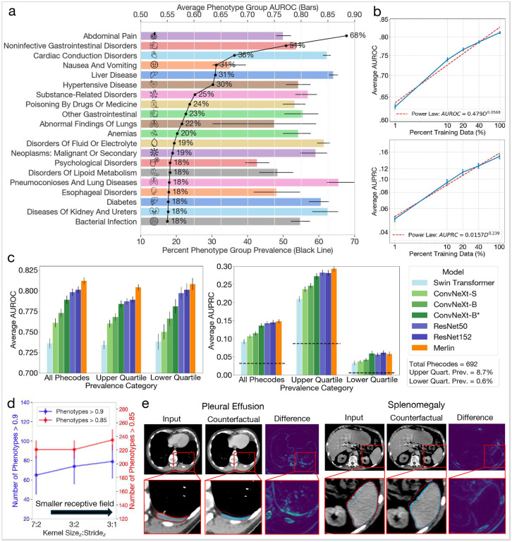
Figure 3: Phenotype classification.
(a) Average AUROC performance for the top 20 phenotype groups listed in order of prevalence (black line). (b) Data scaling law experiments that measure how average AUROC (top) and average AUPRC (bottom) across the 692 phenotypes scale as the amount of pretraining data varies. (c) Average AUROC (left chart) and AUPRC (right chart) across all 692 phenotypes, the top quartile of 173 phenotypes, and the botton quartile of 173 phenotypes across several baseline models. All baseline models are trained using the phenotypes in the pretraining dataset. The dashed lines denote random chance performance. Note that Merlin, which uses the best performing backbone of ResNet152, is further trained using radiology reports. (d) Average AUROC as a function of model stem hyper-parameters. We find that a smaller receptive field yields better performance. (e) Counterfactual analyses of pleural effusion classification (left; image from TCIA61) and splenomegaly classification (image from our internal test set). We annotate the zoomed in images by outlining the pathologies. The red lines border pathologies in the original images. The blue lines border pathologies in the counterfactual images. Counterfactual outlines are drawn over the original images with dotted lines and the original image outlines are also drawn over the counterfactual images with dotted lines. This allows comparing the size and shape of the pathologies between the original images and the counterfactuals, indicating that Merlin is indeed using appropriate features for image classification.

