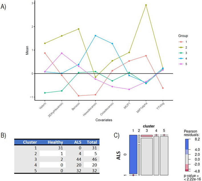
Fig. 3.
Cluster analysis A Mean expression levels of biological markers within the five identified clusters, after normalization to ensure zero mean and unit variance across the dataset. This normalization process allows for a straightforward comparison of biological marker expressions among clusters, using the (normalized) average expression level (represented by a horizontal black line) as a reference point. The colorful lines depict the unique “biological profile” of each cluster. B and C Contingency table and cluster membership with graphical representation of the test. Panel B shows considerable differences in the proportion of patients and healthy subjects across clusters, with a strong prevalence of healthy patients in Cluster 1. The mosaic plot represents the statistical association between cluster membership and ALS prognosis. The horizontal axis displays the distribution of cluster membership, with each segment’s width indicating the relative frequency of clusters. Vertically, within each cluster, the distribution of ALS presence is shown. The areas of rectangles represent the relative frequency of ALS patients and healthy controls in each cluster. A dot over a segment signifies no subjects with that combination of prognosis and cluster membership. Rectangles with similar heights across clusters suggest independence between prognosis and cluster membership (i.e., no association), while significantly different heights indicate an association. Colored cases indicate the strength of association, with red indicating observed frequencies smaller than expected (under the null hypothesis of independence) and blue indicating larger frequencies

