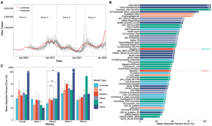
Figure 1.
(A) Visual overlay of real case counts and predicted case counts across all waves examined. Actual case counts are shown in red, predicted counts are shown in gray with each trace representing a different CDC COVID-19 forecasting model on the sqrt plot. (B) MAPE values of US-CDC case prediction models on the complete timeline, i.e., Wave-I to IV. The y-axis is sorted descending from lowest error to highest. The color scheme represents the model category. (C) Bar graph showing the non-parametric Kruskall-Wallis test results. A Mann-Whitney test was further performed for groups with significant differences. Category-wise error was achieved by the models both overall and wave-wise from wave-1 to wave-4. Note that Hybrid models have a high MAPE, i.e., overall: 261.16%, Wave 1: 25.36%, Wave 4: 99.3%, Wave 3: 1421.325%, Wave 4: 54.74%).

