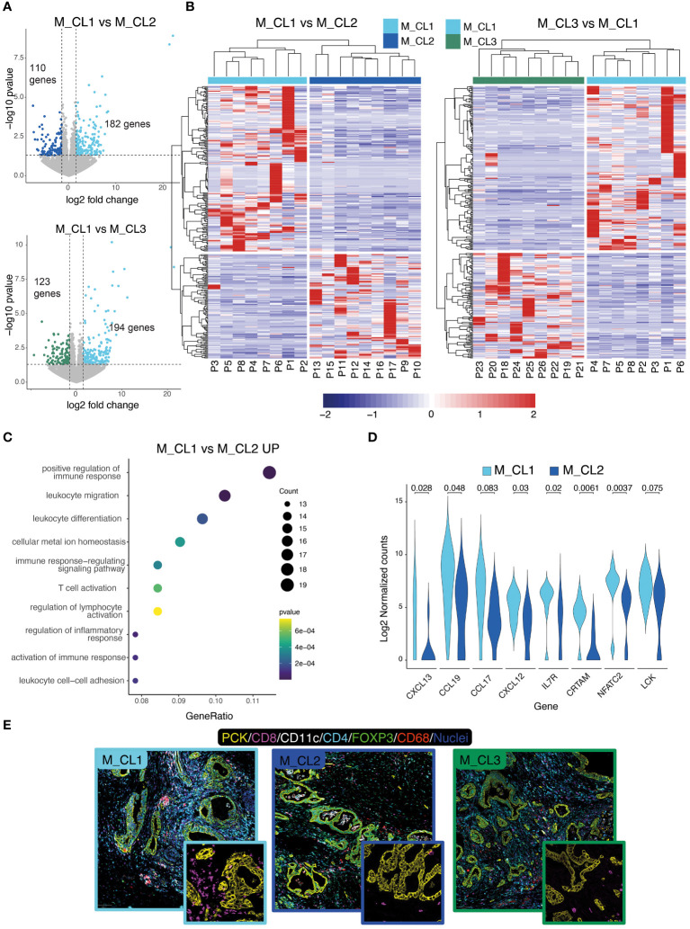
Figure 2.
Transcriptional differences of metabolically distinct PDAC tissues. (A) Differential gene expression analysis on M_CL1 and M_CL2 (top) and M_CL1 and M_CL3 (bottom) transcriptomes. Volcano plots of differentially expressed genes (DEGs) highlighting genes having log2(fold change)>|1.5 and p-value<0.05). (B) Scaled normalized expression values of upregulated and downregulated DEGs in M_CL1 versus M_CL2 samples (right panel) and M_CL1 versus M_CL3 samples (left panel). Gene expression is color-coded from blue (lower) to red (higher). Columns represent samples, rows represent genes. The color codes in the upper part of the heatmap indicate the metabolic group identity of each sample. Hierarchical clustering is shown as dendrogram over the columns. (C) Enrichment pathway analysis of M_CL1 versus M_CL2 samples. Dot-plot shows top 10 enriched GO terms in M_CL1, ordered by gene ratio (percentage of DEGs in the GO term) and color-coded by p-value. The size of the dot represents the count of the genes in the GO term. (D) Violin plot showing the log2 normalized counts of selected genes from the T-cell pathways in M_CL1 and M_CL2 samples (p-value by Mann-Whitney U-test). (E) Immune contexture in metabolically distinct samples. Representative pictures of M_CL1, M_CL2 and M_CL3 samples stained by multiplex immunofluorescence with antibodies directed against Pan-cytokeratin (yellow), CD8 (magenta), CD4 (cyan), CD11c (white), CD68 (red), FoxP3 (green), nuclei (blue). Scale bar= 100 μm. Insets show CD8+ T cells (magenta) and PCK+ tumor cells (yellow).

