
Figure 3.
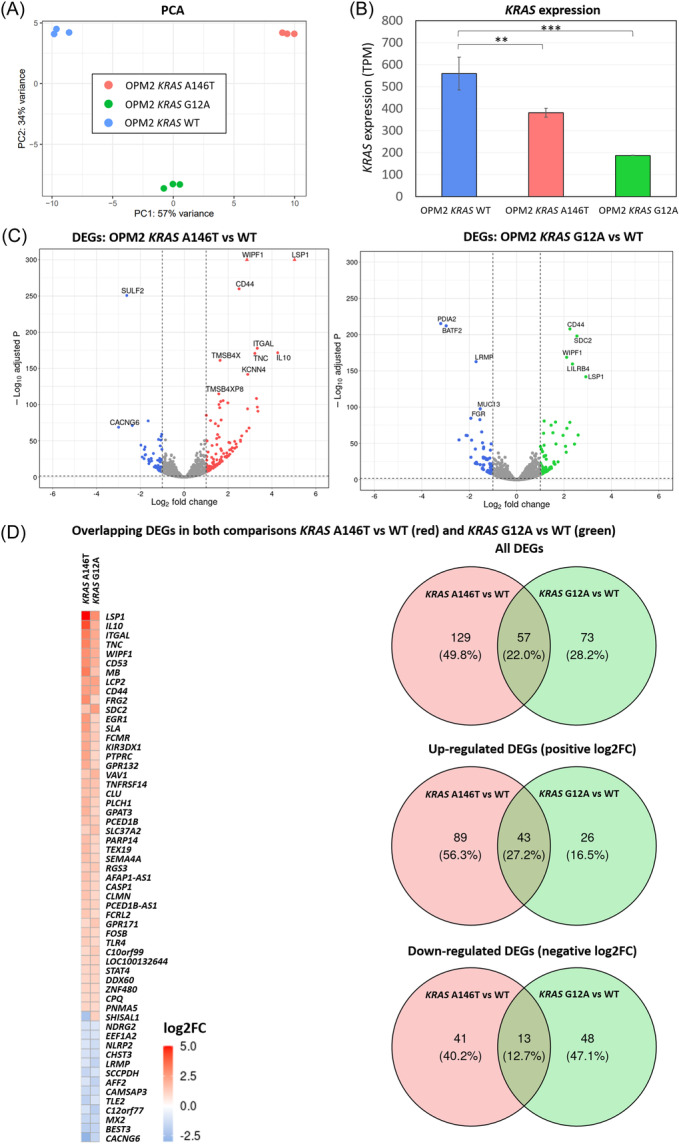
RNA‐seq transcriptome analysis and differentially expressed genes (DEGs) in the KRAS A146T and G12A mutation‐bearing cells. (A) Principal‐component analysis (PCA) results. The figure shows a scatter plot of the first two principal components (PC1 and PC2) depicting the distribution of the gene expression profile according to the mutational status. Percentages on each axis represent the percentages of variation explained by the principal components. (B) Bar plots showing expression levels in transcripts per million (TPM) in KRAS mutants and KRAS WT. (C) Volcano plots indicating gene expression differences between KRAS mutants and KRAS WT. DEGs with an adjusted p < 0.05 and a log2FC >│1│ are depicted in colors. Triangles indicate genes with a –Log10 adjusted p‐value higher than 300. (D) Heatmap of the 57 overlapping DEGs in both comparisons. Log2FC > 0 is indicated in red and log2FC < 0 in blue. Venn diagrams of all DEGs (upper panel), upregulated DEGs (middle panel), and downregulated DEGs (lower panel) found in the two comparisons.