
FIGURE 2.
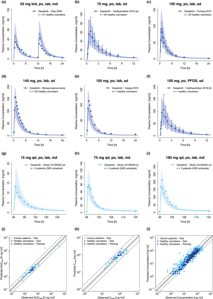
Selection of predicted and observed dasatinib plasma concentration–time profiles of the training (a–d) and the test dataset (e–i) on a linear scale as well as goodness of fit plots of predicted versus observed AUClast (j), C max (k) and plasma concentrations (l). Blue and light blue solid lines show predicted geometric mean concentration–time profiles in healthy volunteers and cancer patients, respectively, with colored ribbons illustrating the corresponding geometric standard deviation of the population simulations (n = 100). Points demonstrate the mean observed data of dasatinib with the corresponding standard deviation (if depicted in the respective publication). Linear and semilogarithmic predicted and observed plasma concentration–time profiles of all studies are shown in Sections S2.1 and S2.2. In the goodness of fit plots, solid lines mark the lines of identity, dotted lines indicate 1.25‐fold and dashed lines twofold deviation. /, no information available; AUClast, areas under the plasma concentration–time curves from the first to the last timepoint of measurement; bid, twice a day; C max, maximum plasma concentration; md, multiple dose; n, number of participants; PFOS, powder for oral suspension; po, peroral; Q5D, five consecutive days once daily dosing followed by two nontreatment days; qd, once a day; sd, single dose; tab, tablet.