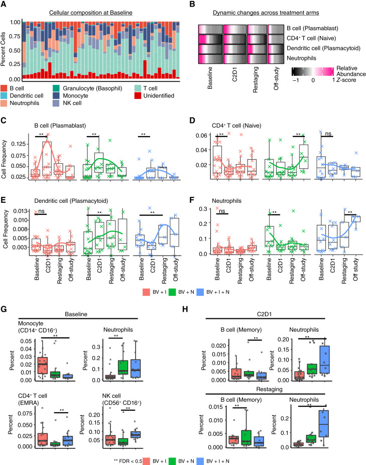
Figure 3.
Cellular dynamics in HL during checkpoint blockade treatment. A, Cell type composition of major cell groups (myeloid and lymphoid) for all available samples at baseline. This bar plot shows the composition and variation of cellular components, including unassigned cells, across all patients. The cell types were identified using a semi-automated approach with the software Astrolabe. B, Heatmap map showing differentially abundant cell type changes over time. The rows are shown as relative abundance or scaled (z-score) allowing comparison across samples for each cell type simultaneously. C–F, Boxplots and line plots colored based on treatment showing the dynamics for the differentially abundant cell types. G, Boxplots showing the differentially abundant cells between treatments at baseline. H, Comparison of cell abundances for different treatments after the start of treatment.

