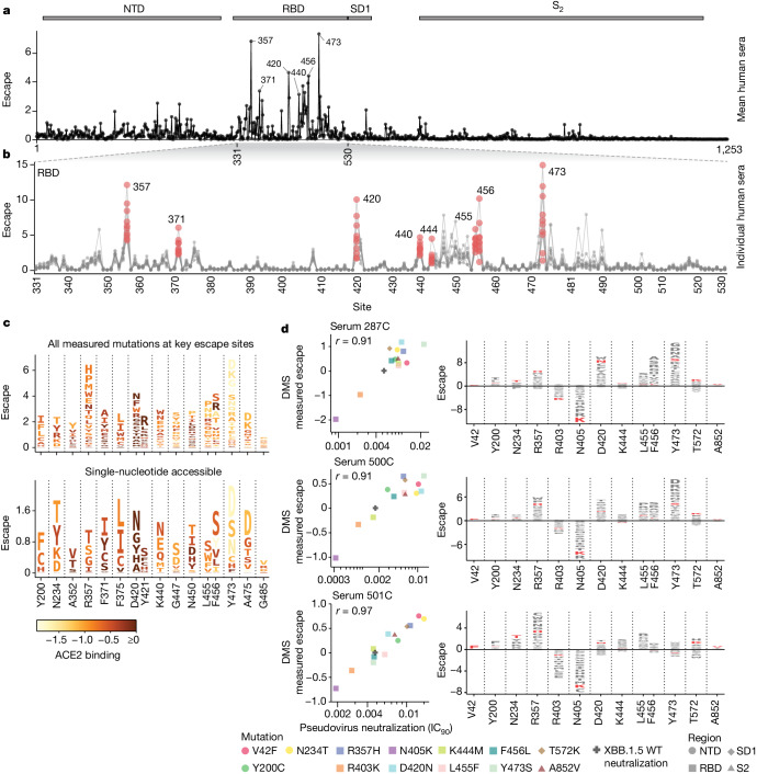
Fig. 4. Serum antibody escape mutations for individuals with previous XBB* infections.
a, Escape at each site in the XBB.1.5 spike averaged across ten sera collected from individuals with previous XBB* infections. The points indicate the total positive escape caused by all mutations at each site. See https://dms-vep.github.io/SARS-CoV-2_XBB.1.5_spike_DMS/htmls/summary_overlaid.html for an interactive version of this plot with extra mutation-level data. b, Enlarged view of the escape at each site in RBD with each line representing one of the ten sera. Key sites are labelled with red circles indicating escape for each of the ten sera. Red data points indicate escape for each individual at select RBD positions. c, Logo plots showing the 16 sites of greatest total escape after averaging across the sera. Letter heights indicate escape caused by mutation to that amino acid, and letters are coloured light yellow to dark brown depending on the impact of that mutation on ACE2 binding (see colour key). The top plot shows all amino-acid mutations measured, and the bottom plot shows only amino acids accessible by a single-nucleotide mutation to the XBB.1.5 spike. d, The left shows a correlation between DMS escape scores and pseudovirus neutralization assay IC90 values for three sera. The right is a logo plot showing escape for all sites with mutations validated in the neutralization assays, with the specific validated mutations in red.

