Figure 5.
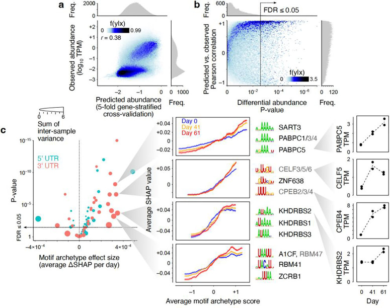
Sequence-based prediction of transcript abundances in neuronal differentiation samples. (a) Observed vs. predicted transcript abundances (5-fold gene-stratified cross-validation). Each point represents one transcript in one time point/replicate. Histograms represent marginal distribution of predicted (x-axis) and observed (y-axis) log-TPM values. (b) Correlation of predicted vs. observed log-fold changes across differentiation. Each point represents one transcript. The x-axis represents the statistical significance for differential log-TPM across time points (one-way ANOVA test). The y-axis represents the Pearson correlation between predicted and observed abundances across time points/replicates for each transcript. (c) Left: Volcano plot of the differentiation-associated change in SHAP value per motif archetype. The x-axis shows the effect size obtained by modeling the SHAP value as a function of differentiation time point and motif archetype score (see Methods for details). The y-axis shows the p-value associated with the regression coefficient. The size of each circle represents the sum of transcript-wise variances of the SHAP values across time points/replicates. Middle: Example motif archetypes with the largest effect sizes and sample-to-sample variances. For each motif archetype, the moving average chart of SHAP vs. motif archetype score is shown (transcripts were sorted by their motif archetype scores, following by mean calculation over sliding windows of 500 transcripts). Each curve represents one time point. The shaded areas correspond to the standard error of mean of SHAP values per sliding window. The top three motifs associated with each motif archetype are shown next to each chart, along with the RBPs that recognize each motif (RBPs shown in grey are inferred to recognize the motif based on homology19). Right: Gene-level TPM profiles for example RBPs across differentiation time points. Each replicate is shown with a separate point. Data underlying this figure can be found in Supplementary Data Table 4.

