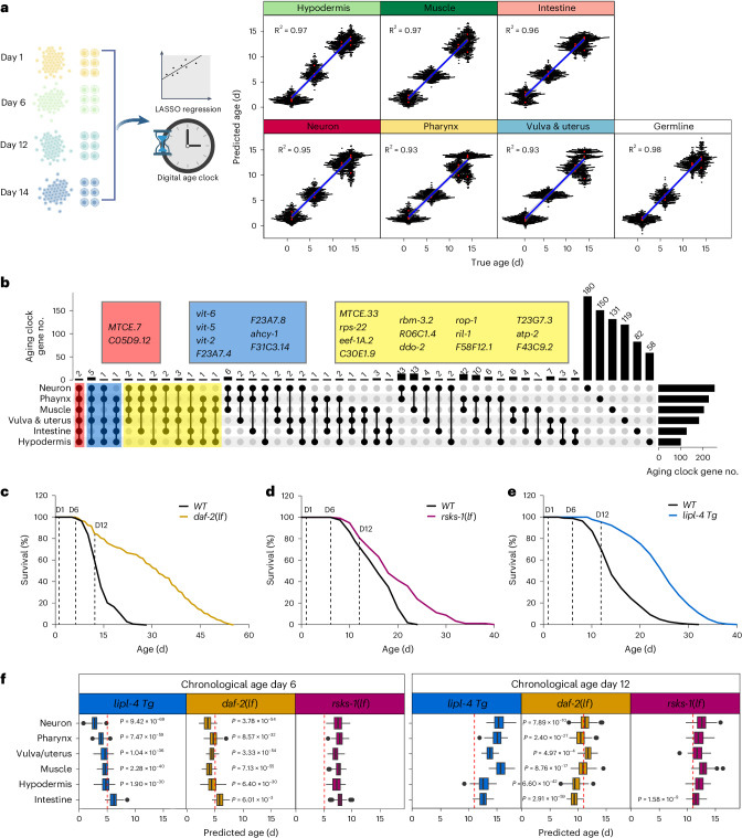
Fig. 5. Aging clocks reveal tissue-specific anti-aging effects of different pro-longevity strategies.
a, The schematic outlines the development of machine-learning-based tissue-specific transcriptomic aging clocks, which can predict the biological age of each tissue based on sn-RNAseq data from four timepoints (left). The performance of tissue-specific aging clocks validated with leave-one-batch-out cross-validation. Red dots represent median prediction for the test dataset, the blue line represents the fitted linear model through the prediction points, and the light gray area indicates the 95% confidence interval. The square of Pearson’s correlation coefficients is shown (right). b, UpSet plot showing the intersection sets of aging clock genes identified across tissues. Genes shared among six, five or four of the tissue-specific aging clocks are listed in red, blue or yellow boxes, respectively. c–e, Lifespans of daf-2 loss-of-function mutant (daf-2(lf)) (c), rsks-1 loss-of-function mutant (rsks-1(lf)) (d) and lipl-4 transgenic strain (lipl-4 Tg) (e) compared to WT. f, Box plots showing the predicted biological ages of different tissues in 3 long-lived strains at the chronological ages of day 6 and day 12, as determined by tissue-specific aging clocks. Day 5 and day 11 indicated by red dashed lines present the cutoff for slowing down the clocks. One-sample t-test, one-sided, n = 100 BootstrapCells cells. P values are shown in the figure. For box plots, the center is the median; the lower and upper bounds correspond to the first and third quartiles, the whiskers extend up to 1.5 times the IQR and the minima and maxima are the observed minima and maxima. The box plot’s box spans the IQR, with the bottom and top representing the 25th and 75th percentiles, respectively, and the median value at the middle. Whiskers extend to the smallest and largest values within 1.5 times the IQR from the quartiles.

