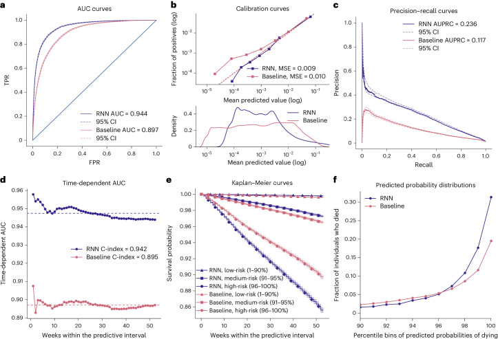
Fig. 3. One-year mortality prediction results.
a, AUC for the RNN and baseline models. b, Calibration curves for the RNN and baseline models. Observed and predicted probabilities of death for each risk decile are reported on a log scale because of a skewed probability distribution, with most values close to zero. This is evident in the bottom panel showing predicted probability densities for both models. A quantile binning strategy for calibration curves was used to ensure an equal number of samples in each bin. c, Precision–recall curves and AUPRC values for the two models. d, Time-dependent AUC curves and C-indexes for each of the 52 weeks in the predictive interval. The dashed lines show the mean AUC for each model. e, Kaplan–Meier curves for predicted low-mortality, medium-mortality and high-mortality risk groups in the testing set for two models. Stratification of individuals to the risk groups is according to their predicted survival over time within the predictive interval. Although the low-risk group covers a large 1–90 percentile range, the curves are nearly horizontal and overlap, with low mortality over time for both models. The shaded areas show the exponential Greenwood confidence interval. f, Fractions of individuals who died in the testing set as a function of percentile bins of predicted mortality probabilities within the predictive interval for the two models. We have only plotted individuals at medium and high risk (90+ percentile). In a and c, the 95% CIs were estimated using 1,000 bootstrap resamples, determining the 2.5th and 97.5th percentiles of the resulting AUC distribution.

