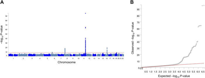
FIGURE 1.
Manhattan plot (A) and quantile–quantile plot (B) of GWA analyses of MetS. In the Manhattan plot, the negative logarithm of the association P-value for each SNP across the whole genome is represented by a dot. The red line indicates the genome-wide significant P-value (5.0 × 10⁻⁸). In the quantile–quantile plot, the x- and y-axes represent the expected and observed P-values, respectively.

