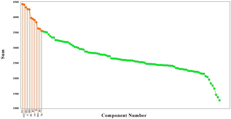
Figure 2.
The brain components sorted based on their causality effects. The causality effects of the components are illustrated in green, and the components which had the top 20% causality effects are shown in orange. The numbers connected to the high causality components are the component numbers (That has been shown only for the top 20 percent).

