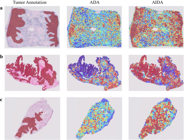
Fig. 8. Comparative heatmap visualization of ADA and AIDA.
Heatmap analysis (a–c) of three samples from the Ovarian dataset correctly classified by both ADA and AIDA methods. The first column is the input slide incorporating the tumor annotation provided by the pathologist, and the second and third columns are the outputs of ADA and AIDA methods. The closer it is to red, the more likely it is to be classified as a ground truth label, while the closer it is to blue, the less likely it is.

