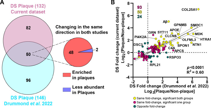
Figure 8.
Comparison of protein changes between the DS plaques localized proteomics studies. A. Venn diagram depicts differentially abundant proteins identified in the current study and the previous DS plaque proteomics study (Drummond et al. 2022, (12)). We identified 132 significantly altered proteins compared to 146 identified previously. From the 50 common proteins identified, 48 were enriched in Aβ plaques and 2 proteins were less abundant in both studies. B. Correlation analysis between differentially abundant proteins in the current study and previous DS localized proteomics. Yellow dots represent significant proteins changing in the same direction (highly abundant or less abundant proteins in both groups evaluated) in both groups compared. Magenta dots represent proteins changing in the same direction, but are significant only in one of the groups evaluated. Green dots represent proteins changing in opposite direction (i.e., abundant in one group and less abundant in the other group evaluated). There was a significant positive correlation (p < 0.0001, R2=0.60) between the two datasets.

