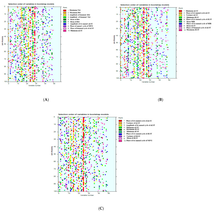
Figure 2.
Graphical representation (‘rainbow plots’) of the ranks of predictor variables to show how often any particular variable was selected across the 100 bootstrap models for models 1 (A), 2 (B), and 3 (C). Each row in these figures refers to a single bootstrap model (arranged in rank order from 1 to 10, with the best model at the top), and each column refers to one of the predictor variables. In each model, the variables are color-coded on a rainbow color scale, i.e., the top predictor variable is shown in red, the second most important variable is shown in orange, and so on (hence the description ‘rainbow plot’ for such images). There is a predominant red line (phase of nLST tri-annual cycle) in Model 3, indicating not only that this variable was frequently selected, but also that it was often selected first in the various bootstrapped models. There are fewer signs of an overall dominant variable in the other two plots.

